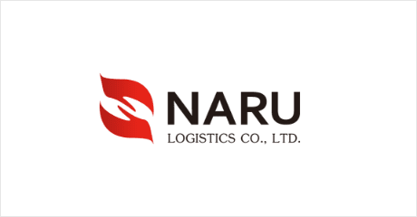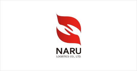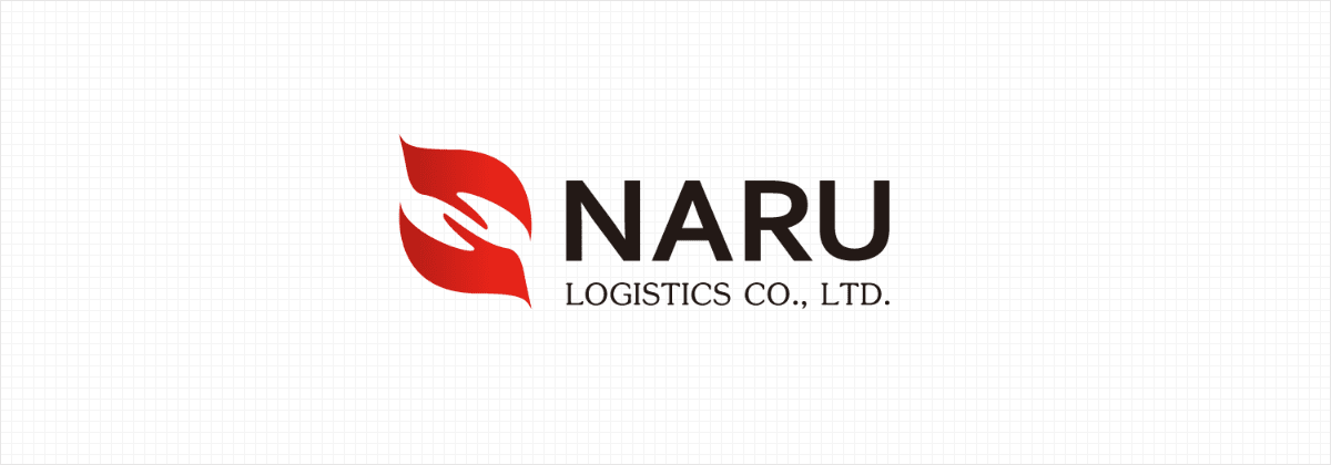
The symbol of two interlocked hands signifies the trust fostered through close collaboration with our clients. The overall design, reminiscent of a ship's sail billowing in the wind, conveys dynamic nature of our work and skills. At the same time, the design is crafted with a neat, streamlined motif to retain a sense of tranquility. This soft yet potent symbol optimally articulates the bright vision and passion of NARU LOGISTICS CO., LTD.
| CMYK | 0, 97, 80, 10 |
| RGB | 93, 15, 20 |
| HEX | #5D0F14 |
| CMYK | 0, 95, 95, 0 |
| RGB | 231, 37, 25 |
| HEX | #E72519 |
| CMYK | 0, 0, 0, 100 |
| RGB | 0, 0, 0 |
| HEX | #000000 |